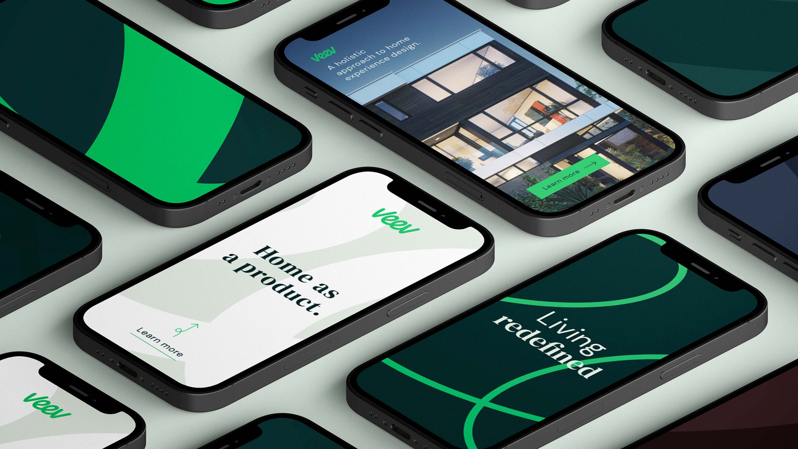
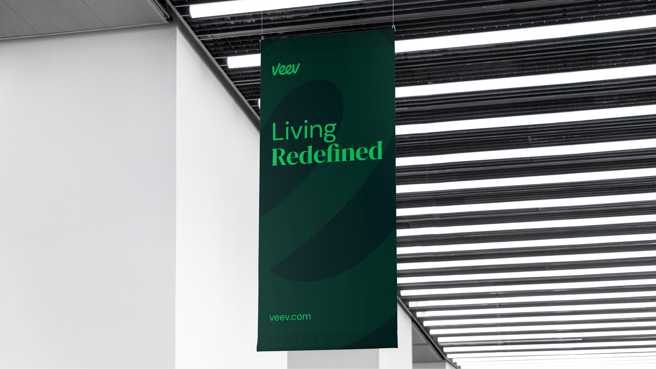
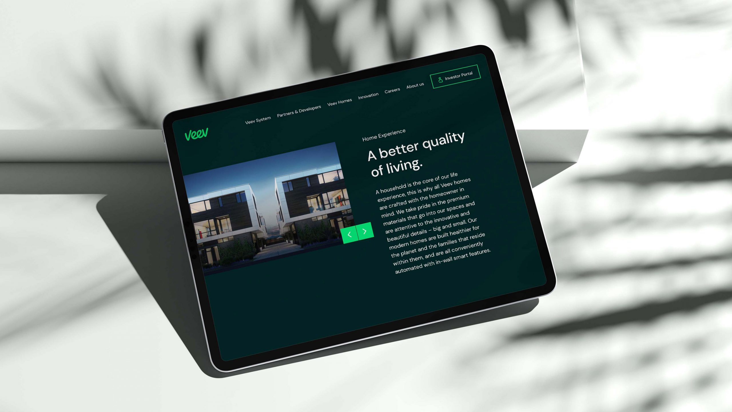
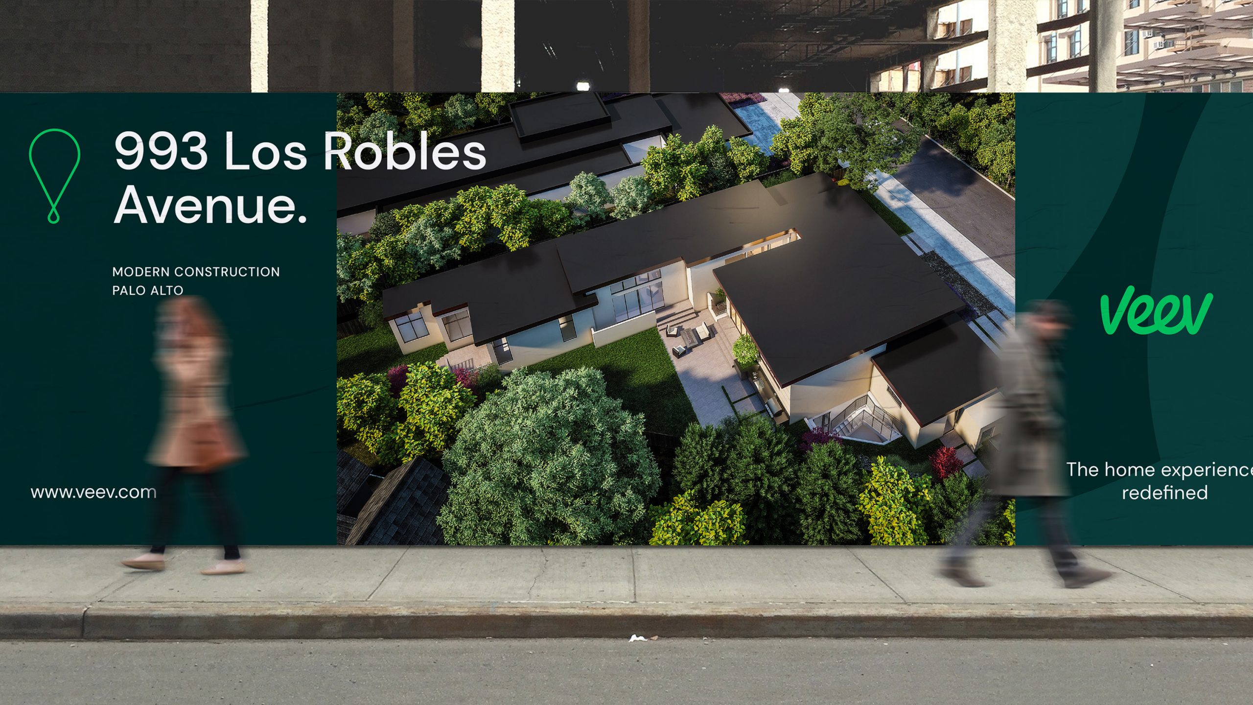
Teaming up with the esteemed type designer, Leo Fields, we embarked on a journey to reimagine the Veev cursive logo. Our aim was to enhance its performance across various channels, establish a stronger brand presence, and ensure optimal legibility even at smaller sizes. The resulting free-form logotype embodies a dynamic and positive flow, radiating a sense of warmth, creativity, and precision. This quality seamlessly translates into distinctive system graphics and communication designs.
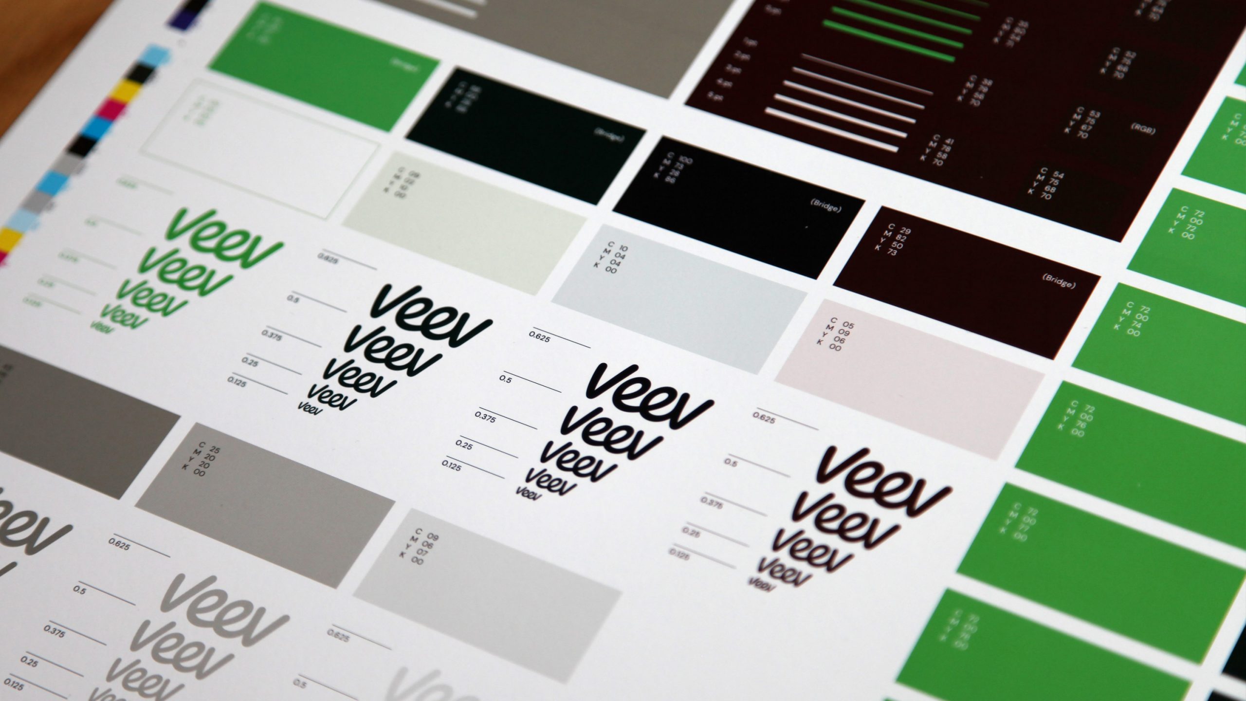
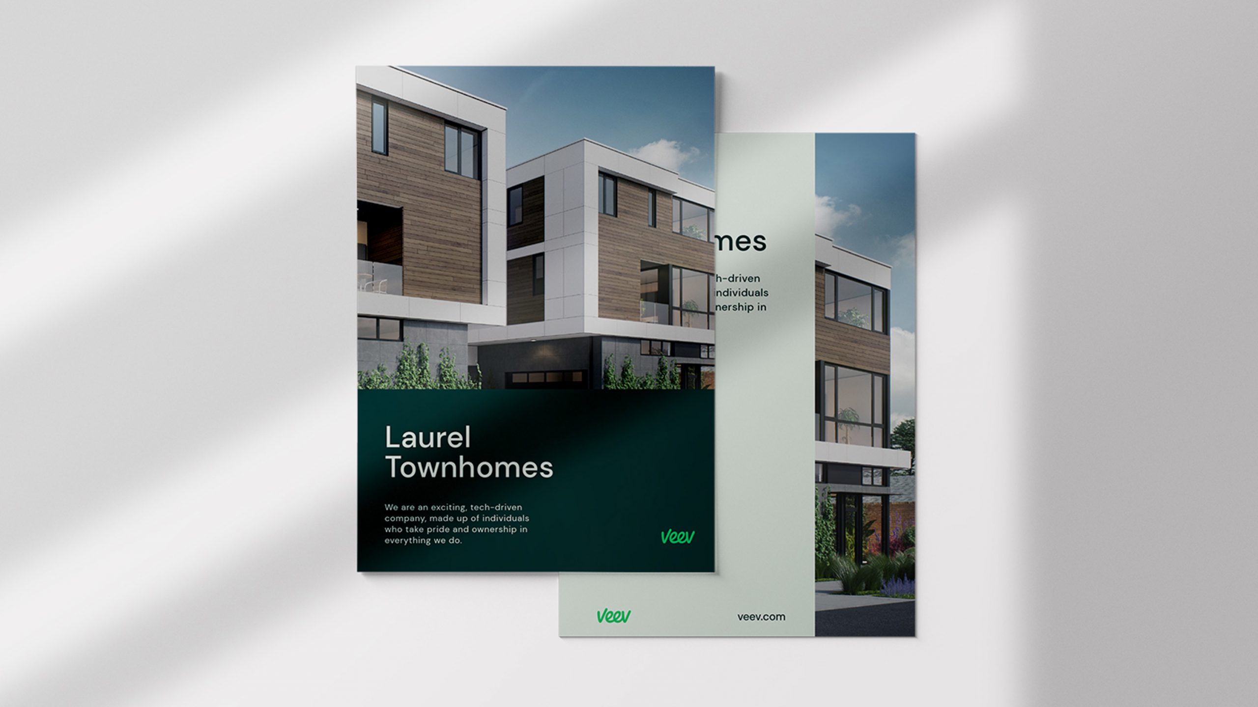
In tandem with the graphic elements, we meticulously crafted a robust type system capable of harmonizing seamlessly across print, web, and internal presentations. Additionally, a secondary color palette was introduced, offering the brand enhanced flexibility in accommodating different subsets within its portfolio.