Defining a new spirit and identity for Saas security experts Vanta

Overview

Vanta is an automated cloud security and compliance platform that helps businesses of all sizes scale by proving they are trustworthy stewards of customer data.

Though Vanta was the first to market, many other players had since entered and were claiming similar product benefits. Vanta needed to clearly differentiate themselves in an evolving competitive space and re-establish themselves as the leaders in the category.

As Creative Director at Moving Brands, I helped to define and create a fresh new look and feel that would convey Vanta’s unique personality, reflect their expertise and ambitions and set them apart.

Services
Brand Strategy / Brand Identity / Tone of voice

Work completed at Moving Brands

Objectives

As a startup, Vanta had embraced its creative and unconventional spirit but now needed to find a balance between having a unique personality and building credibility in the space.

Having evolved from their original offer of delivering fast compliance, Vanta were keen to reposition themselves as a customer-centric partner throughout the entire security journey.

Our approach

We identified a genuine humanity, quirkiness and edge to them that offered real scope to build a fresh and compelling brand. They wanted to be seen as approachable, straightforward experts who care about their customers and sweat the details yet retain a sense of humour – as exemplified by their llama mascot.

With an increasing thirst for human connection in a digital world, we agreed that leaning into those core truths would put clear distance between them and their competitors, who tended to have very similar visual identities and dry messaging.

As we set out to accentuate the genuine warmth of the Vanta brand, we were ever mindful to avoid industry tropes and jargon (fear, padlocks, etc) and recognised the potential to build on their current mascot, originally named Winky.

Results

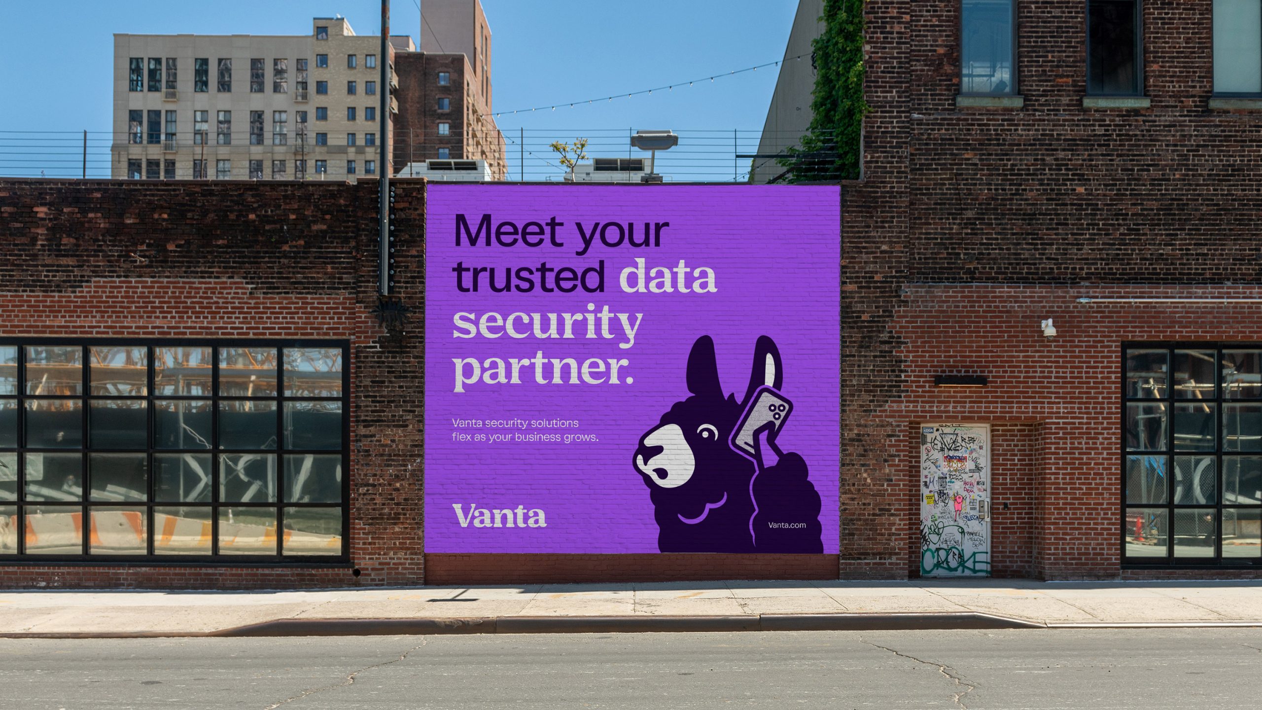
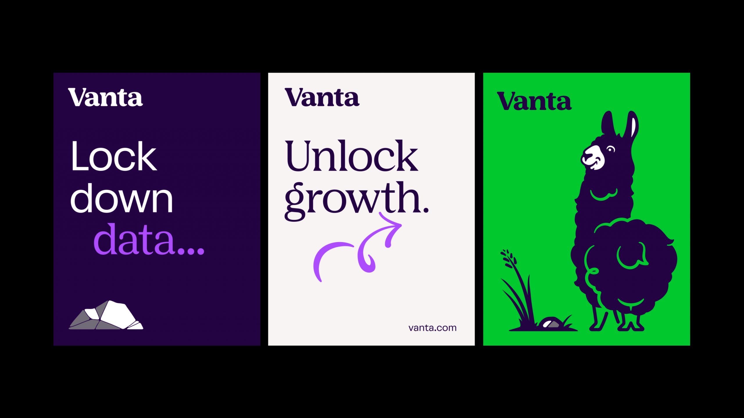
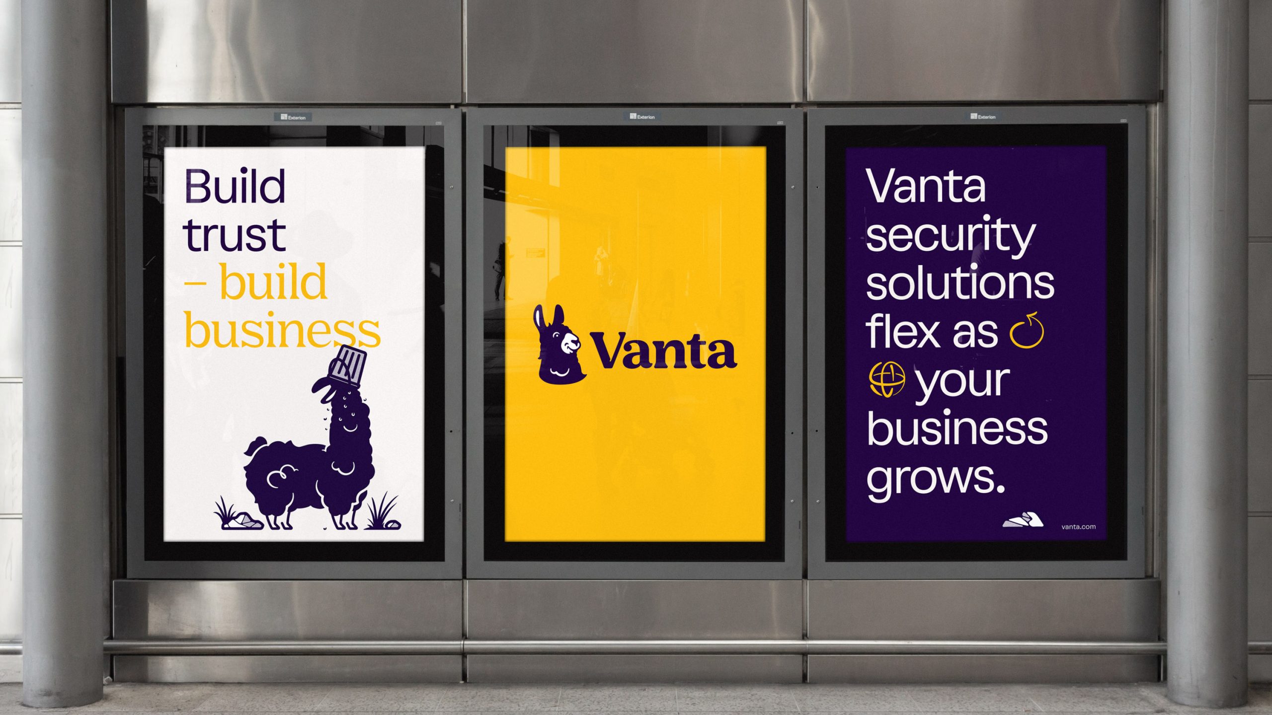
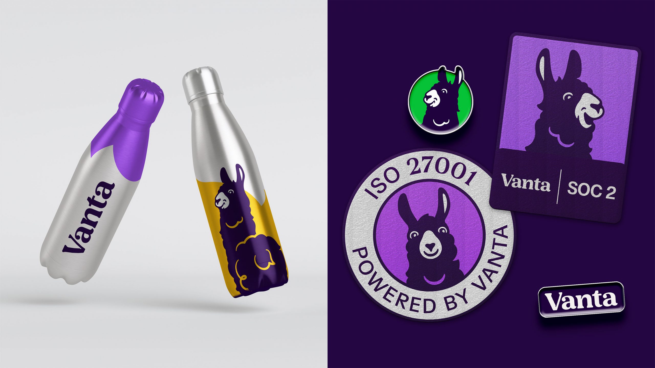
Llamas are territorial animals — protective of their environments, but not aggressive or scary. Previously, Winky had felt like a slightly random bolt-on to the brand. Renaming her iLma, we worked to bring relevance, expression and intent to the mascot and, through voice, spirit, textures, typeface, icon style and scenery, put her right at the heart of the new brand.

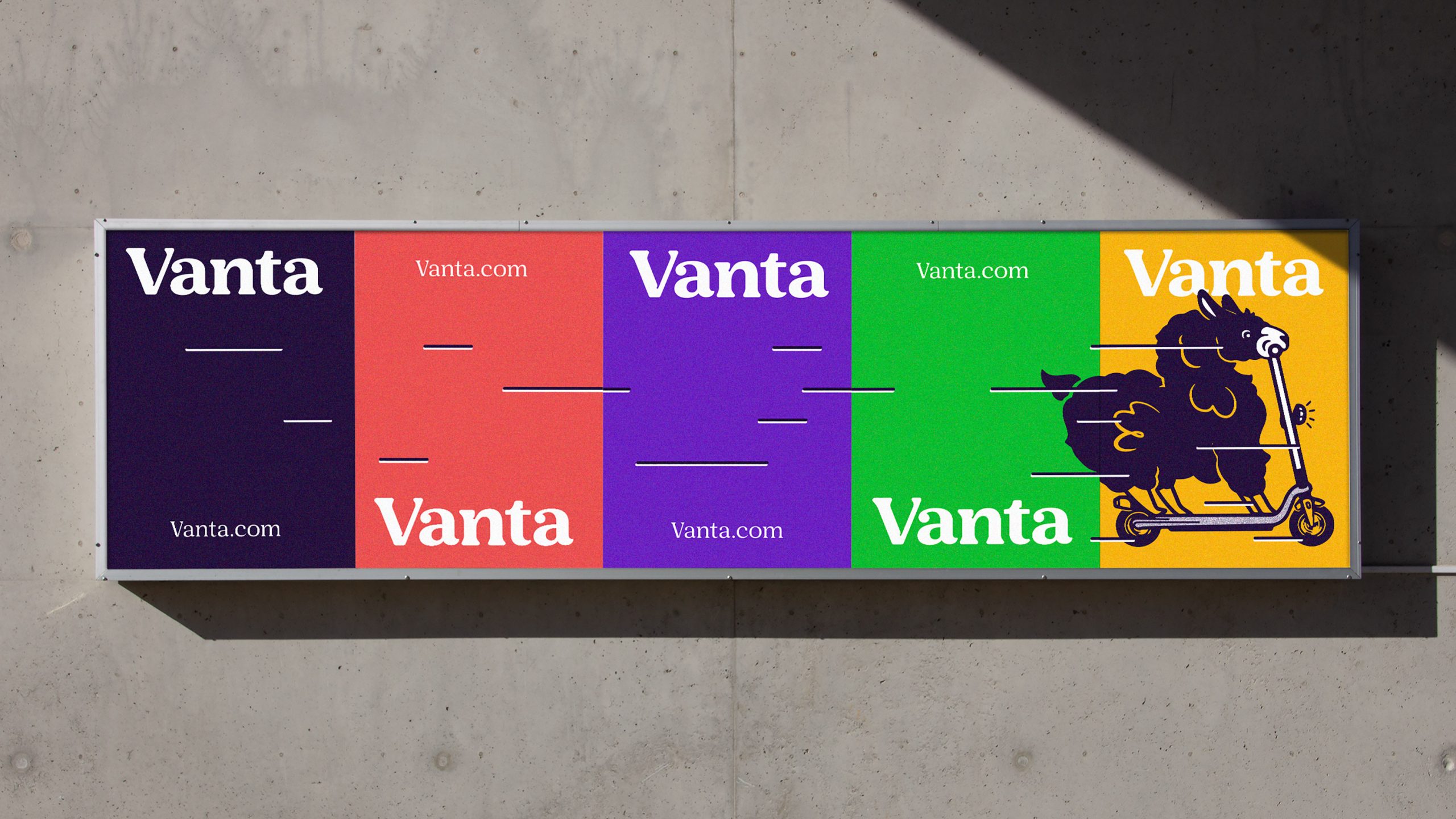
Working from Vanta’s existing purple, we built a more vibrant and complementary colour palette that would help to convey their vitality and playfulness, while our type choices, a combination of formal sans serif and expressive serif, reflected their voice in the industry.

Ultimately, by clashing the seemingly random and absurd with the corporate world of cloud security, iLma acts as an appealing and refreshing antidote in a buttoned-up industry. And that self-confidence and personality now set Vanta apart as the most industry-trusted and human-focused security and compliance partner.

Press enter or esc to cancel