Quartz Network

Brand Identity

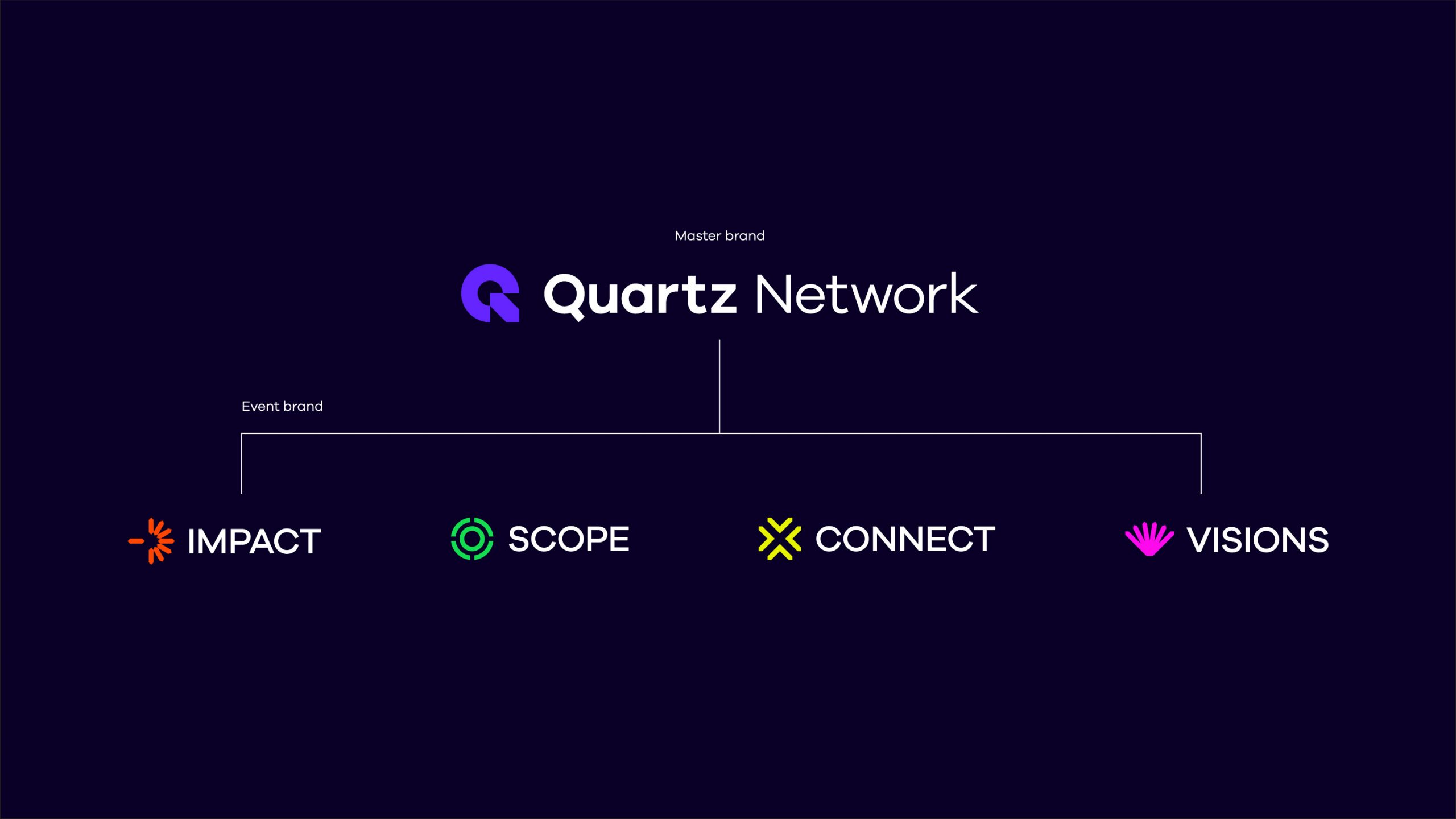
Empowering a business community solutions provider to find its edge

Overview

Quartz Network provides a diverse range of solutions that empower buyers and sellers to seamlessly discover, educate, connect, and manage potential leads tailored to their business needs. To effectively communicate Quartz Network’s offerings and key solution pillars (Events, Education, Solutions, and Community), the organization sought assistance in refining their value proposition and enhancing clarity and awareness across their portfolio of brands and events.

Through a process involving stakeholder interviews, intensive brand workshops, and iterative design sessions, we successfully delivered a strategically refined Quartz Value Proposition, a streamlined Brand Architecture, and a fresh, adaptable visual identity suitable for print, web, and physical applications.

Services
Brand Strategy / Brand Architecture / Brand Identity / Brand Website

Work completed at Moving Brands

Objectives

With a need to build trust in the brand and platform and support marketing efforts to further reinforce the value and benefits across the pillars, Quartz needed a value proposition that would act as a north star and catalyst to their vision.

After a series of strategic workshops, we formulated the value proposition ‘Find your edge,’ serving as the cornerstone for the entire brand identity. This concept, a fusion of visual and verbal elements involving the Quartz name and an aspirational brand narrative, aims to invigorate business owners and sellers to unleash their full potential and explore the distinctive offerings within the Quartz Network community.

‘At Quartz, we don’t simply provide leads; we offer opportunities.’

Our approach

Through our methodical approach rooted in our brand strategy, we established a graphic language, allowing us to craft a suite of visual identities that bolster brand value in individual events while remaining firmly anchored to the Quartz master brand.

At the heart of our visual language lies a distinctive image treatment inspired by the quartz ‘prism,’ a unique element seamlessly integrated into the newly designed brand symbol. This innovative concept enables the visualization of 3D renderings and graphic cues, thereby enhancing and amplifying the Quartz like aesthetic.

Results

The dynamic array of brand assets encompassed a fresh perspective on Brand and Event logos, Graphic Language, Color Palette, Art Direction, Typography, Iconography, and a suite of brand expressions. These showcased its capability to transcend both print and digital media, providing the tools needed to orchestrate events of truly global calibre.

Press enter or esc to cancel