Repositioning one of the worlds largest Saas companies as a global leader
Overview
LogMeIn needed to transform from a ‘house of brands’ to a highly efficient and unmistakably differentiated ‘branded house’ unified under an all-new GoTo brand.
As Creative Director at Moving Brands, I collaborated with a cross-functional team to reposition GoTo, reorganise and simplify their product portfolio and create an iconic, flexible brand identity to enable customer experiences and business growth. The new GoTo helps customers spend more time on what is important to them.
In the last fifteen years, GoTo’s product development has seen the business grow its extensive portfolio of products and services into one of the world’s largest SaaS companies – with more than 3,500 global employees, over $1.3 billion in annual revenue and tens of millions of users.
LogMeIn (GoTo’s parent company) approached Moving Brands for help simplifying their complex portfolio of products and services and reposition them as a leading global tech business.
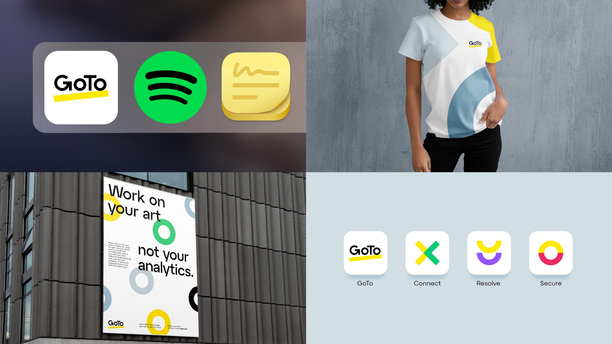
We started with a full and in-depth review of the existing brand and an audit of the competitive landscape. We collaboratively workshopped to define a brand strategy and story at the heart of the brand and moved to redefine both brand and naming architecture to add clarity to a previously complex portfolio of products and services.
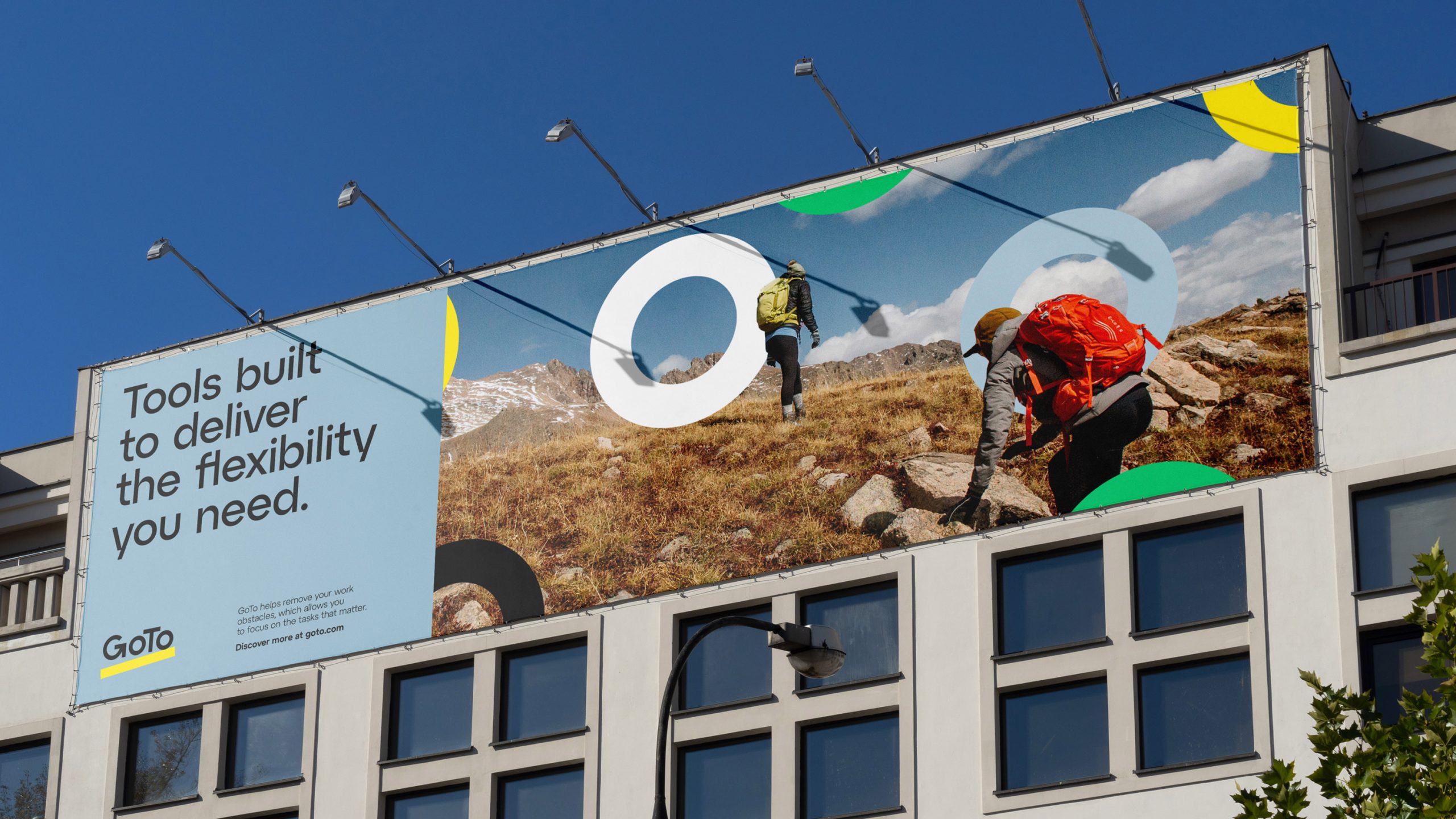
The goal was simple – create a new brand that stands out in a crowded market place and make it easier for customers to understand and engage with the organization’s portfolio of products.
Our approach
In terms of differentiation, LogMeIn had one clear advantage from the get-go. Within its constellation of existing branded offers was ‘GoTo’ – that was simply perfect. ‘GoTo’ linguistically captures the purest essence of everything the business is about: they are, quite simply, the ‘go to’ partner for integrated, easy-to-use solutions for organizations of all sizes looking to streamline and optimize their communications, collaboration, and IT solutions.
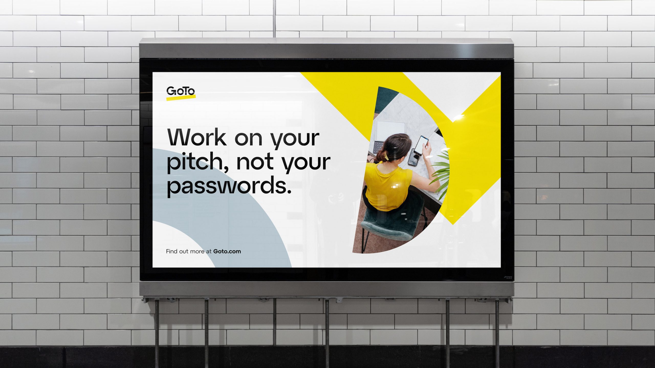
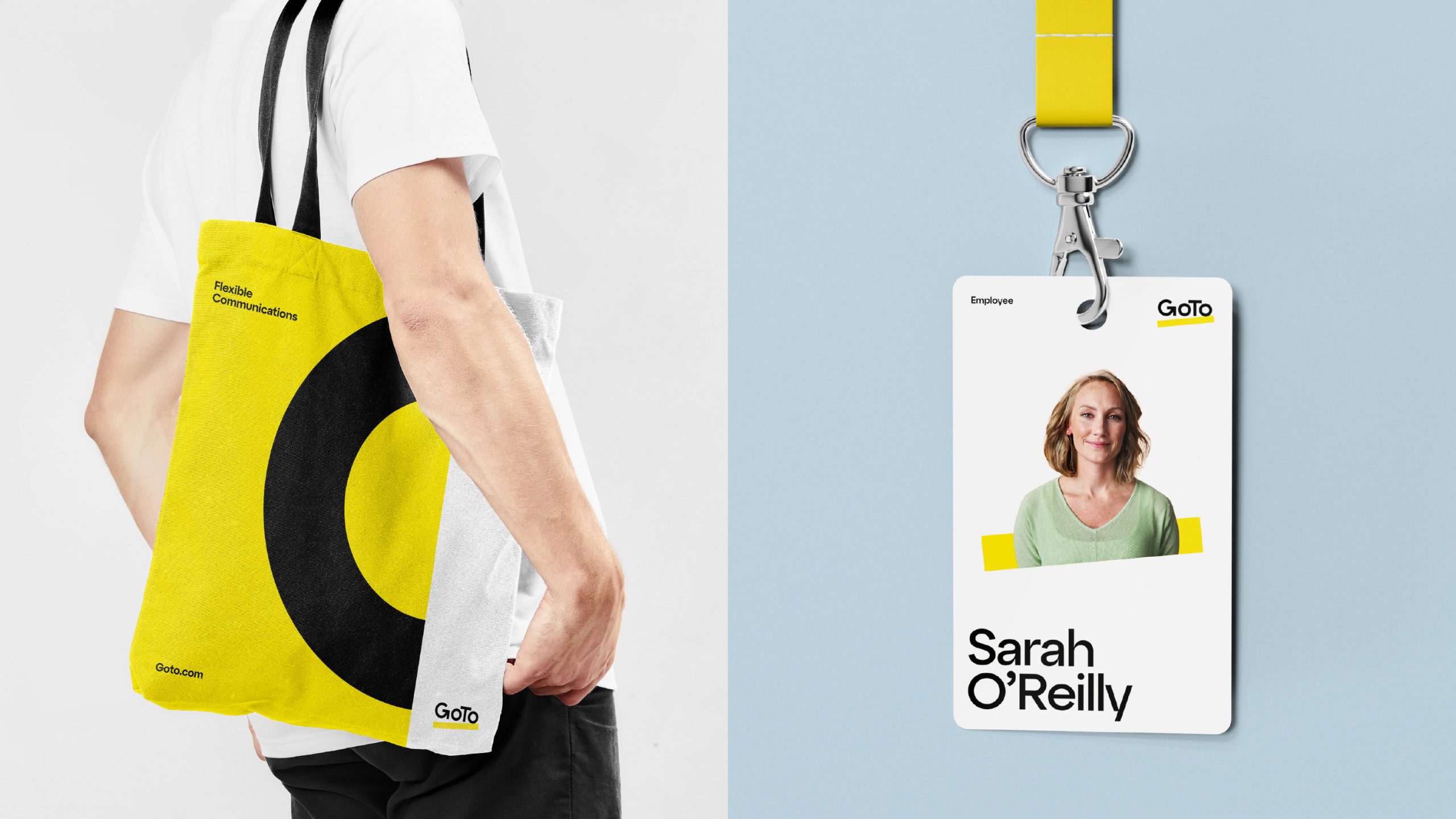
With a new name for the business agreed and a real need to differentiate in the market it was clear that a unique logo and lead color would perform well. Our competitive audit had revealed that yellow would achieve effective stand out and be seen as unique in the marketplace – and with our logic sold into our project clients, CMO, CEO and the board, a new vision for the GoTo brand was agreed.
Results
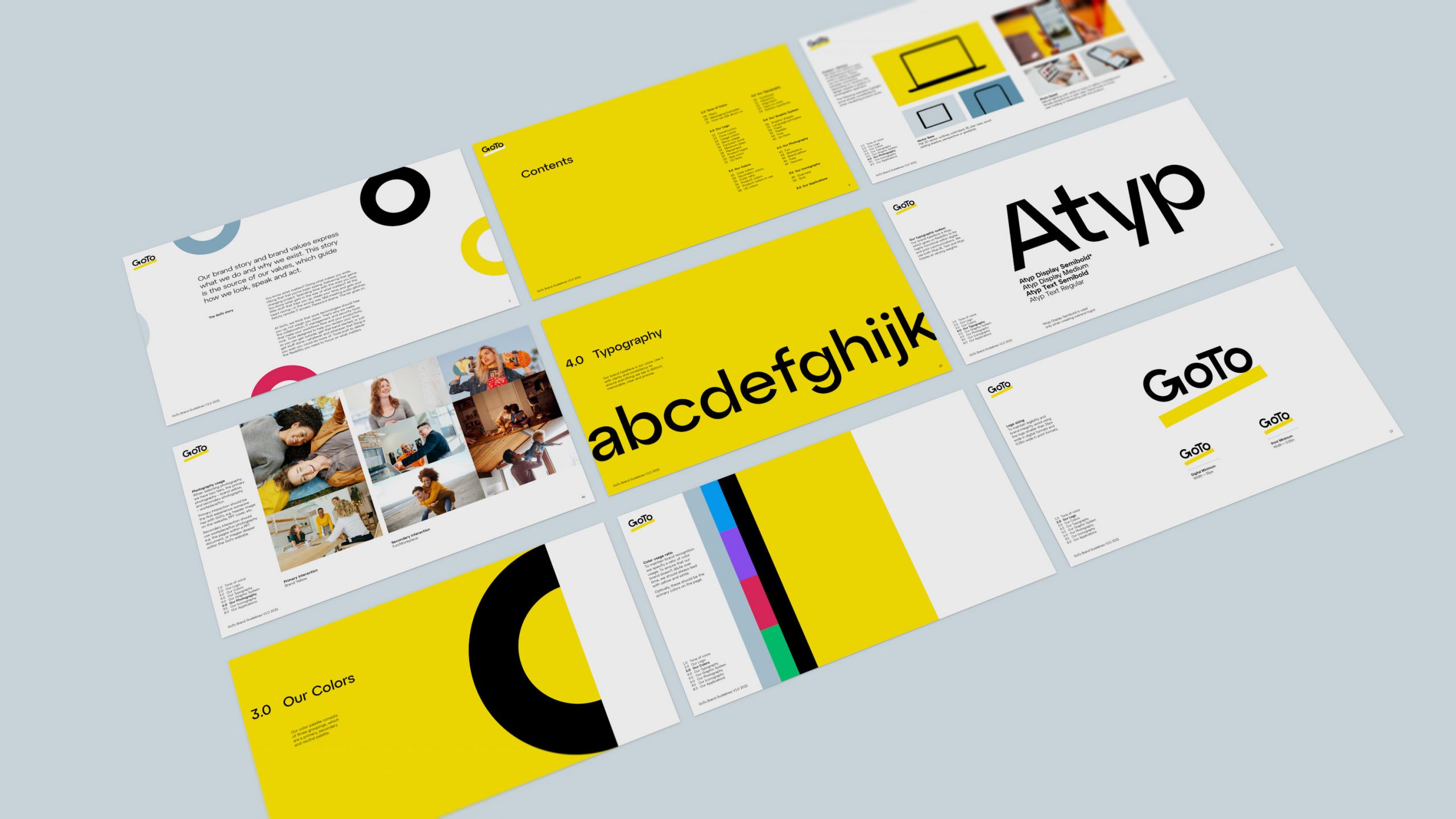
We delivered on multiple work streams for GoTo including; Competitive Audit, Strategic positioning, Brand Story, Brand Architecture, Brand Product and Portfolio naming, TOV and Messaging, Brand Identity, Focus Groups, Mnemonic, Brand Guidelines and Localization Guidelines as part of our comprehensive engagement. Now reinvented and repositioned to take its rightful place in the world – Welcome to the all-new GoTo.
“The new GoTo identity is a declarative breadth of fresh air with a clear intent to differentiate across sectors.”