EasyPost

Brand Identity

Evolving a logistics retailer from start up to IPO ready brand

Overview

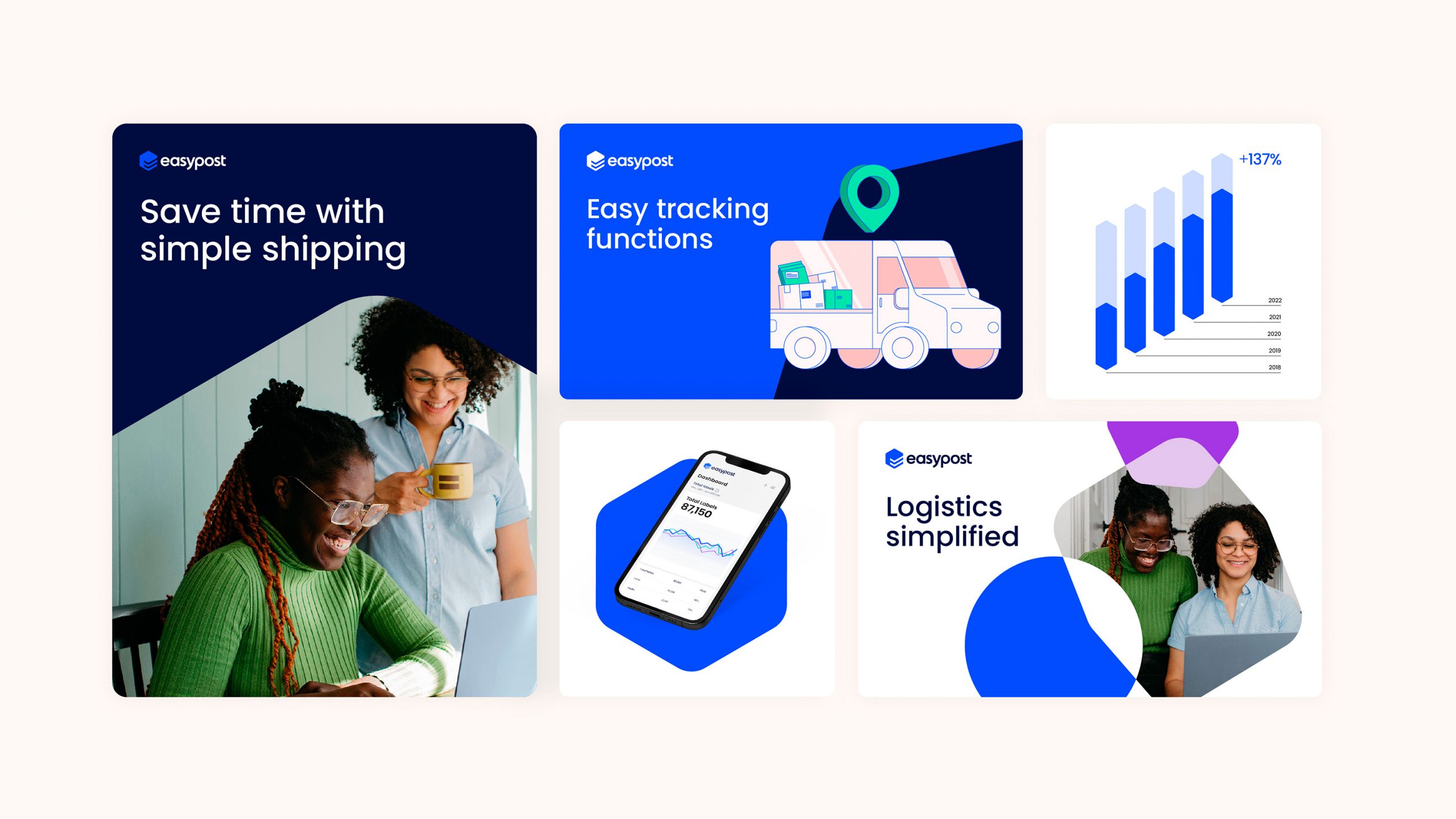
EasyPost simplifies the world of parcel shipping, removing technical complexities and making it faster, easier, and cheaper for anyone to ship any package, anywhere. Partnering with carriers such as UPS and DHL, they’ve established a unique service for an entire ecosystem of carriers and Ecommerce store owners.

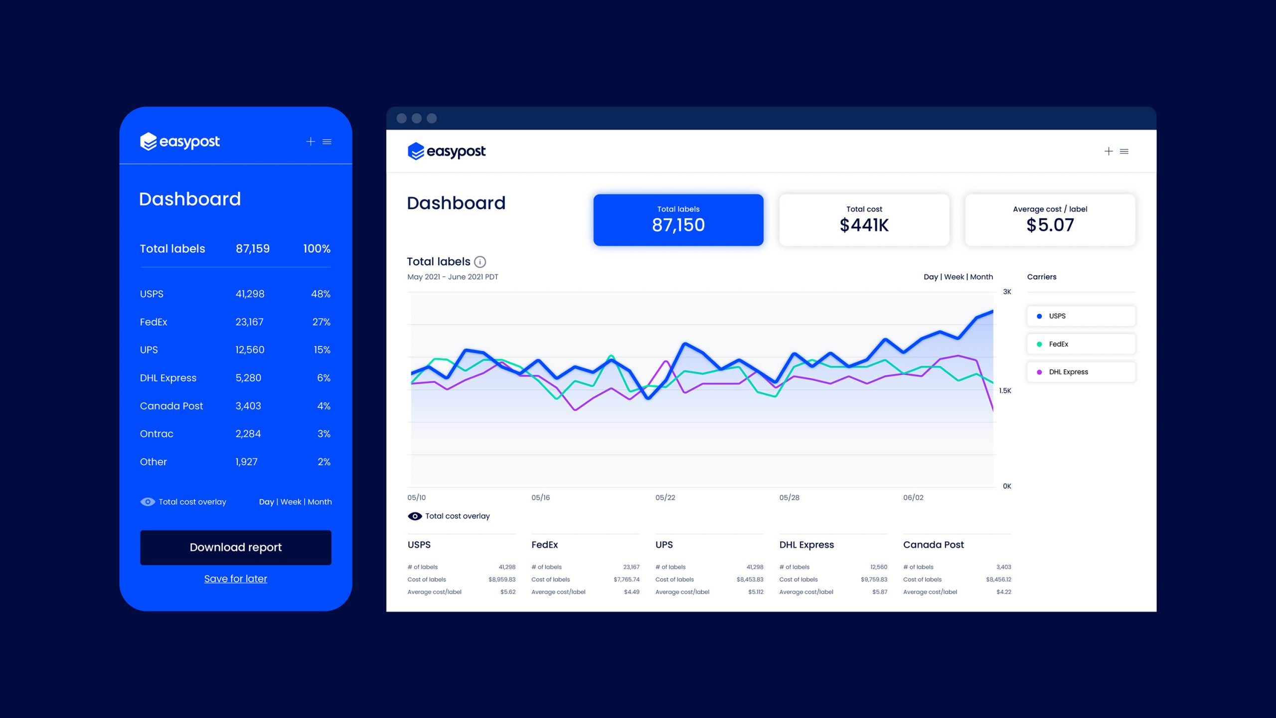
Through their unique API forward product they are able to track live data from the postal service, process and feed this data back to the end user to help predict delays, accurate timings on shipments and the most cost effective shipping rates.

Services
Brand Strategy / Brand Identity / Tone of voice

Work completed at Moving Brands

Objectives

EasyPost were looking to consolidate their portfolio and streamline their identity in order to prepare themselves for an upcoming IPO.

Having been through several rebrands since their conception that hadn’t quite hit the mark, EasyPost approached Moving Brands to help define and create an iconic brand identity that supported their output. They were also looking to improve their website, and develop their marketing and sales tools for maximum effect, establishing a brand that could excel across all media and touchpoints.

As Creative Director at Moving Brands, I helped position EasyPost as a cutting-edge industry leader with a new brand symbol, tagline, graphic language, and story to reflect this transformation. EasyPost went live with their rebrand in December 2022, now primed for IPO success.

Our approach

From the get go there were aspirations to retain characteristics in the existing logo and find a way to further evolve the current design system. Starting with an audit of their existing brand assets we were able to embrace equity in the current wordmark but also ensure they were able to differentiate and stand out in market.

Through meticulous rounds of iteration, we were able to transform the existing logo with the introduction of a bespoke graphic symbol.

The brand symbol, an abstraction of a typographic ‘E’, takes on the form of a three dimension package with ‘packaging tape’ capturing the unique letter forms. Conceptually the mark also evokes a ‘double check mark’ meaning that symbolizes characteristics within the product API such as ‘request and response’, or a package being ‘sent and delivered’.

For the the wordmark we partnered with Dalton Maag to create a bespoke set of characters that were rooted in the existing design.

“The revised mark is contemporary yet true to where they have come from and will future proof the brand for many years to come.”

Results

The new brand symbol is supported by a robust set of dynamic system graphics that are able to flex from bold and expressive movements to calmer expressions that are all visually derived from the brand symbol.

The end result is an evolution of the brand which evokes themes of simplicity (simplifying the shipping process and connecting customers with carriers.) Using overlapping geometric forms we were able to elevate a sense of connection and interaction into something that feels human and friendly.

The graphic language is reinforced by the tag line ‘Built to Deliver’ which speaks to their unique API forward approach and their core competencies of the API forward technology and end customer value of reliability – keeping things moving and an end to end solution that is simple and easy to use.

Press enter or esc to cancel